Overview
Since I had the proportion of shots at each location, I thought it would be simple to do the same thing for teams and I could create heatmaps for each team. It was in fact not as easy as I thought it would be, but I eventually got it done.
My first thought was simply group by team then get the proportion of shots at each location. Then I would subtract that number from the total proportion of shots from that area across the league. I was working with that for a while and it kept giving me strange results, like the 2014-15 Buffalo Sabres had a good amount of blue in front of the net, which I figured from the worst team in the past 15 years, probably shouldn't happen. Then I realized I was measuring the teams total proportion, so Buffalo shot less than the rest of the league from the front, but a LOT less than the rest of the league from elsewher, so proportionally it looked like they shot more from the front. That is something that could be useful from a team strategy perspective, but with my bins being as small as they are, it appeared to be basically random. I would need to bin it like I initially binned the shot locations map (with the fancy colors, left in front, right in front, high slot, outside, the point) for there to be meaningful and consistent amounts of data in each bin.
Instead of working with shot proportions after that I just started working with raw shot totals and just had to compare it to the league average. So I calculated the total number of shots from each location, then the total number of shots by team from each location. I then took the difference between those two numbers, and for every location took the mean difference, which was deep in the negatives for almost all locations, at most zero if the team was the only team to take a shot from that location. That is why I didn't want to do proportions because for shots like those, the difference in proportions would be 100% to basically 0%, instead of just 1 to basically zero, so they would always appear as dark blue, and skew the alpha system I had. And shot types like that only occured from outside the zone, in places that I just didn't care to track or analyze. After I had the differences in means, I took the mean difference at each location, and subtracted each team's difference from that number to "center" everything around zero. I probably could have just taken the z-score to standardize everything, but I don't hate to keep looking at raw totals because most of the heavily shot from locations are the important ones in front, so shooting more from there should be every team's goal, so I'm fine with them being weighed more in this heatmap. I'm under the naive assumption that the fact that there are more shots from in front causes there to be larger variances in the number of shots from in front, which causes the differences to be larger, which, because I didn't take the z score or account for the larger variance, that is where the darkest blues and reds will appear. After taking that difference, I basically just created that plot the same way I did for any of my other shot maps, except I added the one additional line that made below league average spots red, with close to 0 being light and far from zero being dark, and above zero being blue.
Results
The results for this are pretty simple, it's just a bunch of the same graph over and over again with diiferent teams/seasons, and therefor slightly different colors. There are way too many teams for me to post them all here, so I made an app that you can play with and look at any team you want, here.
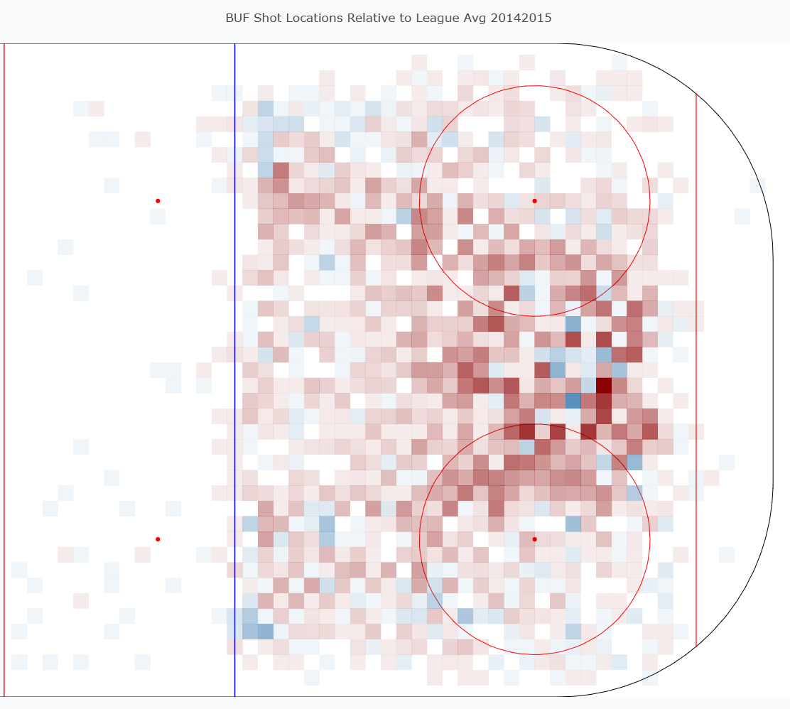
There weren't really many individual teams that I just look at and could get much from without having a comparison to something else. But this Buffalo team was one of them... again, every time I see something like this I'm just shocked, like I know they were bad, but just in EVERY SINGLE POSSIBLE way of the game. I can see why it's taken that team 10+ years to get back to any semblance of playoff contention (and the Eichel trade... and the ROR trade... and the Reinhart move...).
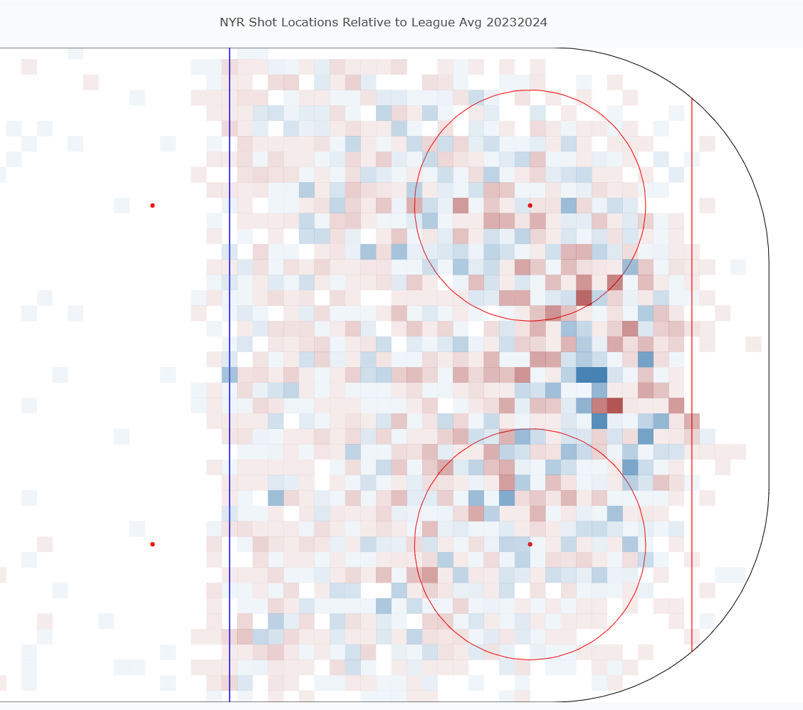
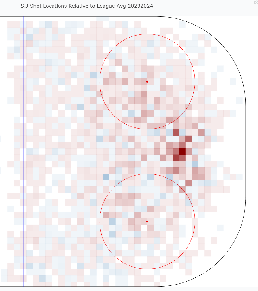
Finally, I just want to show a quick comparison. Obviously this is comparing the presidents trophy winners to the bottom team in the league from 23-24. There is still quite a stark difference in the colors on this map though. NYR has its fair share of red, they weren't the most dominant presidents trophy winner we've seen, but they are still a lot more blue than SJ, who has deep red right in front which we know is bad, and most of their blue as been pushed to the incredibly low percentage shots on the outside. While looking at each individually, I'm not sure I would be able to clock that NYR was the presidents trophy winner, but I can clearly see that they were a much better team than SJ was. Obviously I choose a very pronounced gap in the standings for this comparison to make it obvious, and comparing the 16th team vs teh 17th team probably wouldn't do much. However there also really isn't much between those teams, other than maybe some stylistic differences. If you're heading into a matchup against another team and you see a lot of blue from one particular spot, be prepared for that team to shot a lot from that spot.
Data
I did get most of my shot data from evolving hockey's querey feature. I hae tried to run scrapers to get data directly from the NHL api, but it's always been a mess every time I've tried to build that scraper in particular. I've built many others succesfully, but just never one for the NHL API. So the EH queries are the next best thing, and they come mostly pre-cleaned. Though they were behind a paywall, I feel like I've done enough data manipulation that I can share this, especially in a portfolio style website that I don't plan on being profitable from.